In the digital age, a lot of our day-to-day lives have been made electronic, from organisational to recreational. Digital is convenient, fast, and frictionless.
The prime example here would be music. For users of music platforms, it takes only seconds to access any song you could imagine. But behind the touch screen, physicality is lost. Physical media is often cast aside and reserved for collectors or nostalgic listeners.
What if the digital allowed us to experience the physical once again?
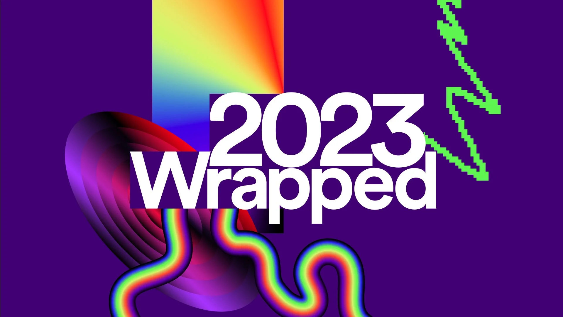
Spotify Wrapped is an annual event where users can look back on past year of activity. My project is an offshoot of this feature, bringing the personalised nature into the physical realm.
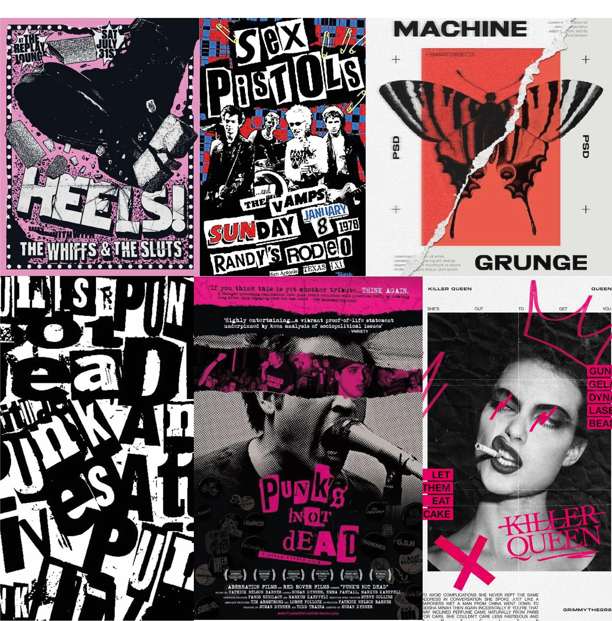
The visual identity of this project was inspired by punk aetshetics. This is a moodboard based on that aesthetic.
These are the final printed components. More info on these is available in the ‘System Design’ section.
The Box
New Blood
Cards focused on introducing the user to new artists in the scene of their chosen genre, chosen based on their previous activity. The cards feature a short blurb and QR codes to curated playlists.
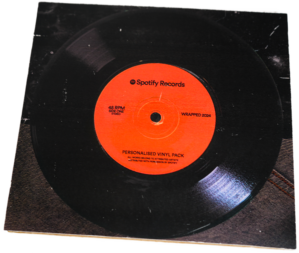
Vinyl Pack
Vinyl sleeve to hold multiple vinyls or CDs, designed using my images of denim as well as a grunge texture to fit with the punk aesthetic.
Hero Image
This section covers the core parts of the visual identity, explaining the reasioning behind each choice.
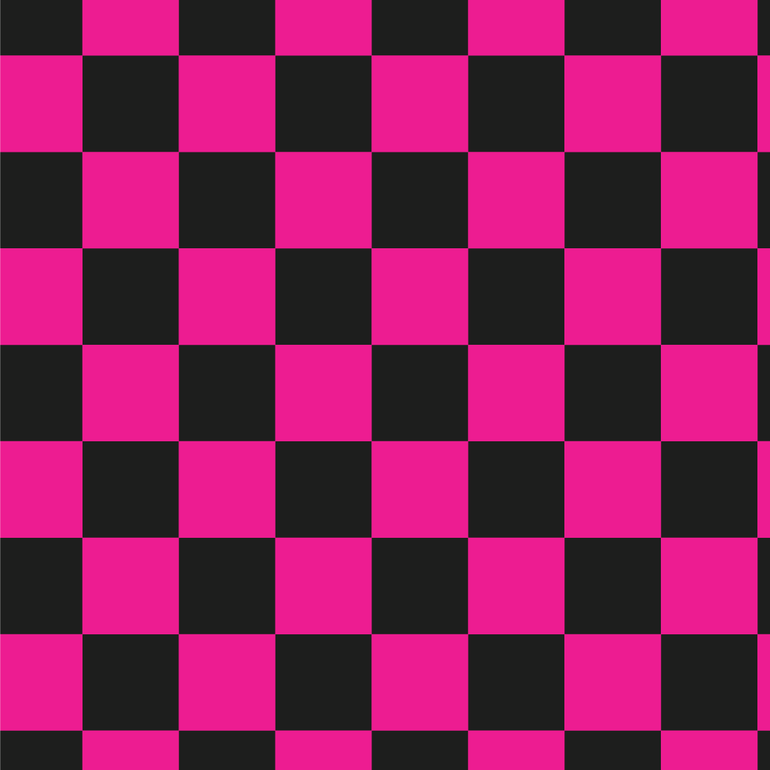
Pink checkered pattern
Used to break up the largely black colour of my branding with a bright, ‘loud’ colour that fits with the punk theming and other colours used.
Torn paper texture
A scan of crumpled, torn paper manipulated in Photoshop to use as a background for the different parts of my project. It sells the D.I.Y, chaotic nature that’s integral to punk aesthetics and culture
Spotify text
Maintaining Spotify’s type and green colour helps tie the visuals back to the brand through recognisability
Wrapped text
Inspired by the text of The Sex Pistols’ logo, this helps immediately communicate the genre to users as this style has become a staple of punk design.
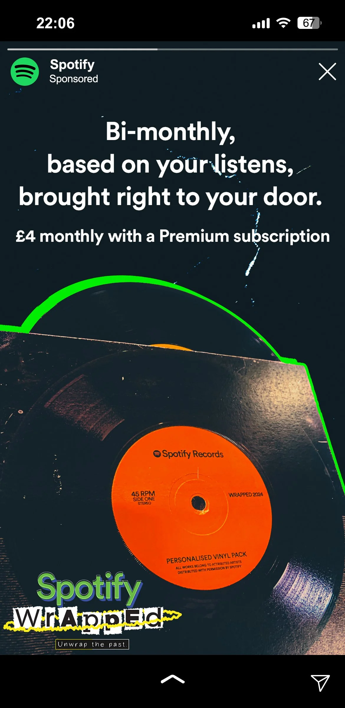
The first step focuses on informing users about the service through ads on Instagram stories, mobile ads, and desktop ads.
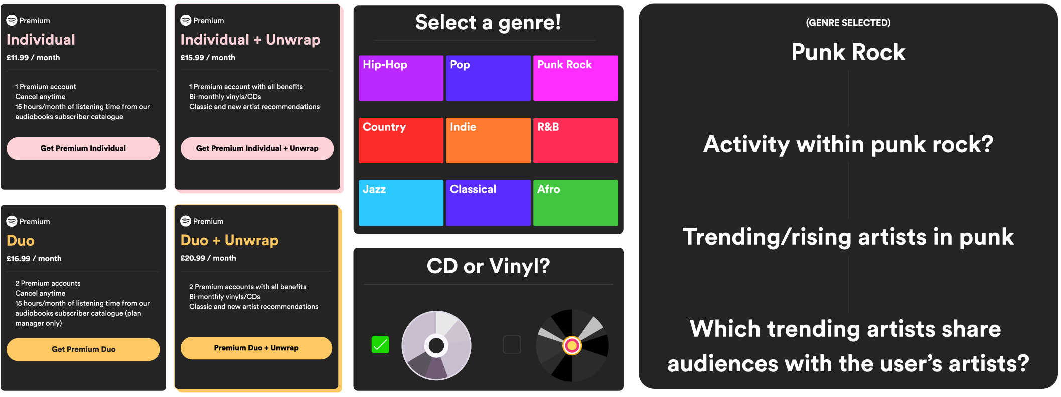
I designed these diagrams to showcase the system of my project through 4 steps: inform, choice, produce, and experience.
The second step involves the user customising the service, offered for £4 extra a month. Users pick their genre, and whether they want vinyl or CD.
The algorithm takes prior listening activity to pick artists based on shared audiences.
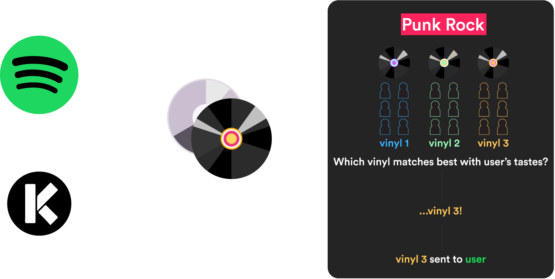
The third step covers production. In the UK, vinyls would be produced in partnership with KeyProduction, a company that presses and packages vinyls/CDs.
Spotify would produce a selection of vinyl/CDs from a given genre, each with a mix of different artists, and assign users the most appropriate one.
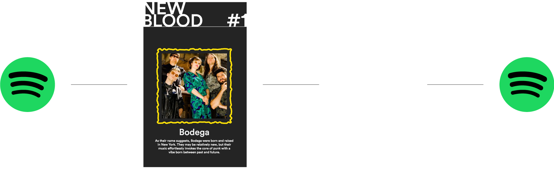
The fourth step covers the cycle from the app to the service, and back.
Through the music sent to the user along with the New Blood cards, they are driven to experience new music, with QR codes directing them to new albums.
As the user listens to this new music, it informs the algorithm for the next delivery.

