Final Animation
For this animation, I animated the sequence from 0:04 to 0:22 (rocket cloud and panning upwards animated by Alice Gow)
The Brief
Taking a piece of text (written or spoken) as your starting point, create a sequence that compliments, enhances or subverts the content.
You may consider using a TED talk as a starting point, a poem or edit a section of written text using a ‘cut-up’ method as pioneered by William Burroughs. Make sure you analyse the text and consider how imagery works with that text.
While the work can be experimental and explore the formal properties of media form it must have an identifiable and considered context and audience. Where will it go, who is it aimed at?
Developing the idea
The basis for our idea since the start was loneliness. We wanted to base our animation around it as a theme, and initially, we thought of doing loneliness in general, but this ended up being too wide of a concept to work with.
Eventually, we thought targeting an audience of children was a good, simple basis to go off of, and also allowed us to experiment more.
We then looked into the concept of the 'friendship bench', a bench where you could sit down to strike up conversation with a fellow student, and we thought this would be the perfect iconography for our animation.
Narrowing down our target audience helped us come up with a visual identity for our animation. We came up with the aesthetic of a child's drawing, utilising squiggly lines and crayon textures.
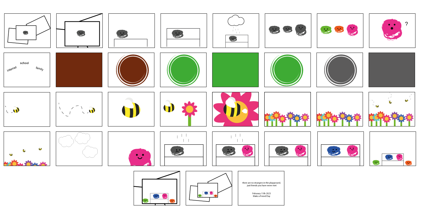
This was the very first storyboard for our animation, drawn by Amelia using ideas from each person in the group.
This storyboard features our very first concepts, such as having the animation start with live-action footage, which would zoom into a drawing and transition into the animation, giving it the sense of the drawing coming to life.
We then went and did one storyboard each, and took the best ideas from them to create a final storyboard.
The general idea is a child, represented as a grey squiggle, sitting alone on a bench before another child comes to join them on a bench. The grey squiggle turns green, showing them becoming happy before being joined by the rest of the children. They play together, and the frame goes still, zooming out of the paper
After this, our group decided to each make our own storyboards following the same general concept. This would have us all convey ideas in different ways that we could then combine into one final storyboard that uses the best parts from each.
This was my storyboard, using bees to easily convey how friends can help each other, as they are very social creatures which depend on each other.
Final Storyboard
We decided to have the script of our video be a poem as it was easy to understand, short, and memorable.
Feedback from a tutor compared the vector style of my storyboard to the kid’s TV show ‘Hey Duggee’
The show is targeted towards the same audience as our animation, and features a vector-based artstyle. We looked into the show and loved how it looked.
We took inspiration from the show, gearing our character and world design towards being more vector-based, while keeping aspects of children's drawings such as large bodies with small arms and legs.
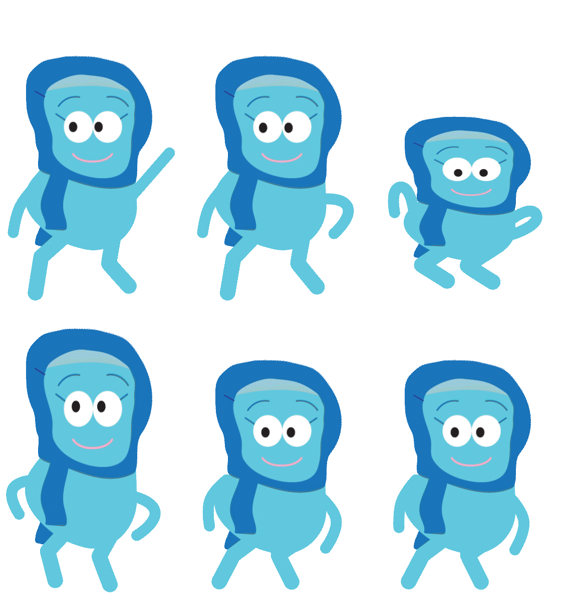
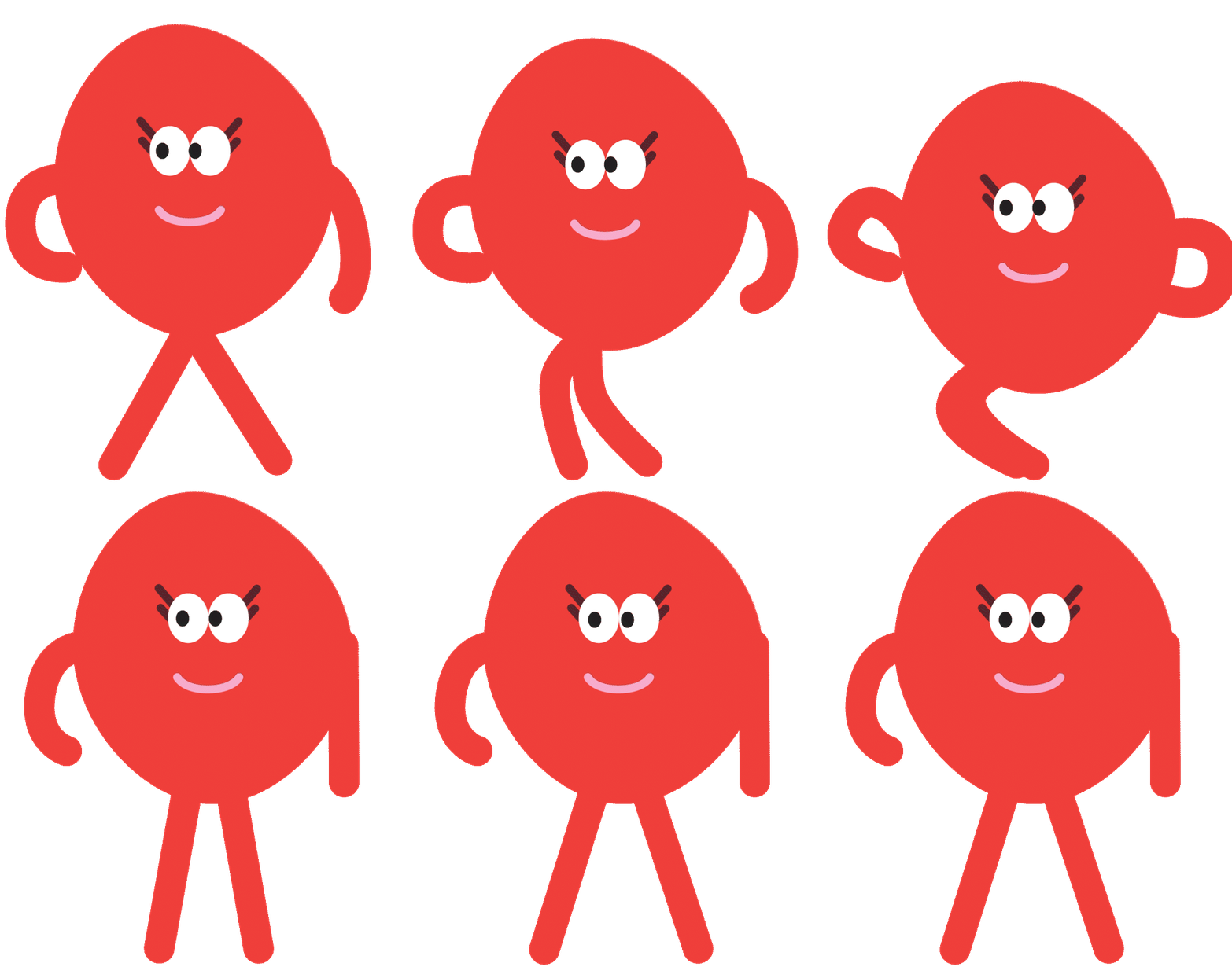
For our final character designs, we wanted to have diverse characters, as this would make sure anyone could identify with at least one of them.
(characters designed by Rebecca Miller).
Grass and sky background.
I made the environment assets for our animation with input from my teammates, following the vector-based style inspired by Hey Duggee
The Buddy Bench. Bright yellow to stand out as the centerpiece of our animation.
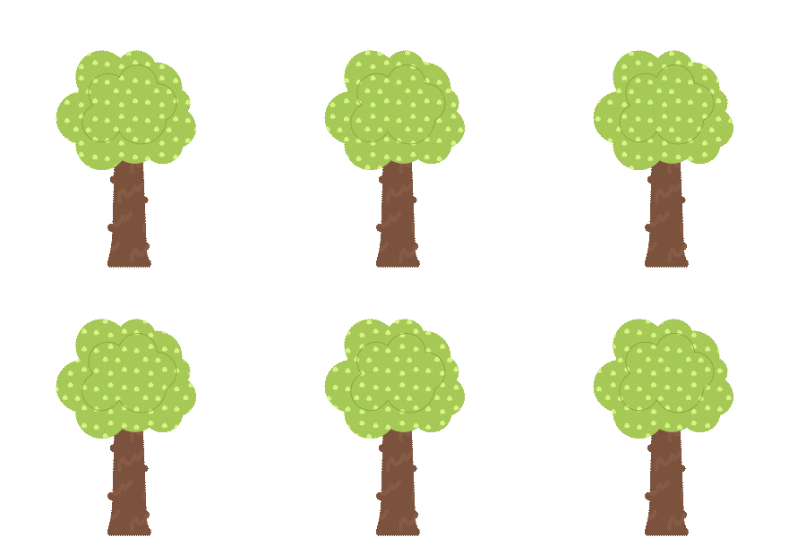
Tree.
Bushes with flowers. In our animation, Amelia included a mouse hiding behind the bushes to go along with the line in our script.
Throughout this project, we learnt After Effects, employing various techniques in order to bring our world to life.
It was important we had clear, non-verbal tells for what our character was feeling. This allows children to easily identify what's going on and removes the need for dialogue, removing potential language barriers.
Click HERE to see some of the experimentation that helped me realise the final sequence!
Sigh animation uses squash and stretch to show an inhale that works with the character’s simple designs.
New animation of character jumping onto bench. This used the squash-and-stretch technique to emphasise motion. Eyes also move to show anticipation from the character.
Simple leg swaying animation to go along with the sadnness of the character.
Old animation of character jumping onto the bench.
Tree with animated leaves help the world around the characters feel more alive.
My old blinking animation (top). this was later changed for the new one (bottom) that was easier to replicate for multiple blinks.


